CRESS brand and website
Our challenge as a team was to do a full rebrand for the Center for Research in Earth and Space Science. Our goal was to provide CRESS with a fresh, dynamic logo that was still formal, as well as a website to go with it.
My role
Branding
Team
Luisa Jahn
Joshua Gaspar
Timeline
12 weeks
(Feb-Apr.)
Tools
InDesign
Illustrator
Figma

Representing The People Behind
The Science
In collaboration with the client, we decided to take a path that was educational and formal enough to represent such an organization, but still held the qualities of being fresh and approachable. Something that represents the work of the organization and the people behind it.
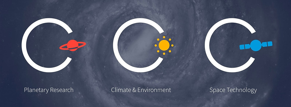
Celestial Motifs Brought Down
to Earth
The circle quickly became a central aspect of the brand as it is a sort of motif found in the field of earth and space science, from orbits to the shape of planets. The logo concept that was decided on was a minimalistic nod to the solar system diagram, one of the most iconic symbols of space science and education.


Launching
CRESS Into the
Online Sphere
The website was the final deliverable that was designed as a part of the CRESS re-brand. By the time the website was designed, there was already a clear vision for how CRESS should present itself to the world online. The end result is a website that feels futuristic and cutting edge, but maintains a friendly exterior.